I fell in love with branding a few years back—not sure exactly when, but there was a shift at some point when how people showed up in the world and how businesses did the same started standing out to me. Maybe it started during art class in primary school. If you’re not new here, you might remember me sharing that, even though I didn’t send for the ‘what you wanted to be when you grew up’ discourse, I did have a love for graphic design. (Read more on this here.) Specifically, lettering and calligraphy— something about it just felt so right to me. Constructing those letters was something I looked forward to. I’d sit with my teachers to learn how it was done, and when I finally got it, I’d do it anywhere and everywhere, even outside of art class, on any free surface I could find. At the time, young me was dealing with her existential crises, and finding something so thrilling brought me a deep sense of comfort and happiness.
Since then, many Pinterest boards or designs have been made. I got into actual graphic design and fell in love with it, but I’ve now come to accept that I’m more of an enthusiast than a designer. I can do design, but I don’t have to do design because it isn't really ‘my thing.’ This was hard to accept, as I was hell-bent on being a designer. That changed when I decided to decenter myself and focus on collaborating with professionals. I can help with creative direction and offer advice on what elements should look or feel like, but I make space to work with other talented people. I’d be missing out on a lot if I didn’t. Hence why I started my atelier in 2022, called TGA. It didn’t last long, though—just cause life, lol. And again, different seasons. In the past, I cringed over it, but now I’m open to the possibility of picking it back up in the future. Or maybe never, lol. Whatever the Lord wills.
Here are a few things I’ve learned along the way:
Don’t be scared to let your imagination and ideas run wild. I used to want to limit or restrict my ideas and make sure they were organized or palatable enough for others, but it never worked. Now, I embrace my process as it is, and every time, it never fails me.
Use keywords and phrases. This is the beginning of everything—even before the mood board (I know, that says a lot). Like in the first point, I let my thoughts run wild. It doesn’t matter if they don’t make sense to others yet. I understand them.
The mood board is king. This is probably my favorite step in the process. I love a board down. Pinterest is tired of me at this point. I bring my keywords or phrases to life through this board.
Some of my favourite boards:

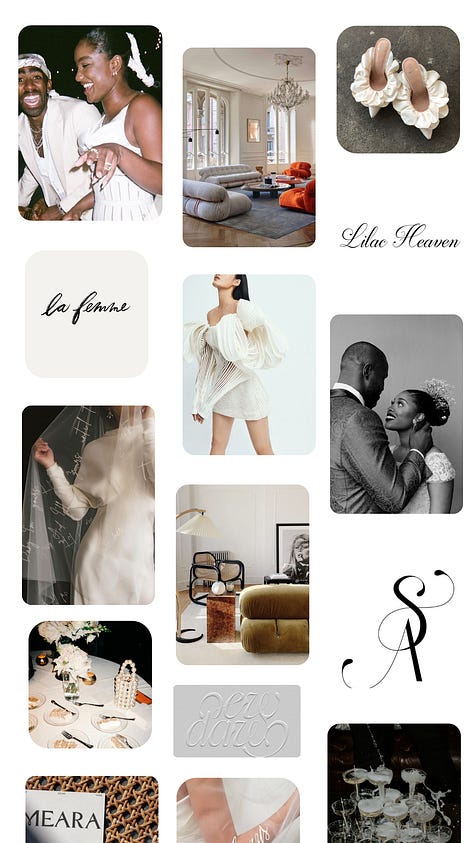


References are everything. I make sure to find references and get inspiration from anywhere. I need to have a source or overall theme. I can get inspiration from a restaurant, film, book, sign, quote—the sources are endless. You just need to pay attention.
Do what feels right to you and don’t overthink. Oftentimes, that’s the first idea that comes to mind. But if you’re not sure, always feel free to hear what other people have to say. At the end of the day, though, make sure you don’t lose the essence of what you’re trying to create. Remember, too many cooks spoil the broth.
Prioritize your presentation. I know it seems like this contradicts what I said earlier, but follow me for a second. Everything is done in stages, and as someone who loves design and aesthetics, this shouldn’t just be seen in my ability to create a pretty mood board but also in how I present the final draft to my client or team.
Now, let’s get into today’s main agenda.
I’ve been using this Substack as a way to put my brand strategy/design cap back on and honestly, just play. I’ll be walking you through the entire process, and at the end, I’ll reveal the final results and unpack the world of TIM and who the TIM girl is. This was inspired by
’s deep dive into her elusive (international) hot girl universe.The Word Dump Phase
This was just me putting down keywords and things I envisioned for the brand identity of TIM.
Slow, thoughtful, reflective, personable, witty, fashionable, it-girl quality, classic, creative, soft, Romantic
Places that come to mind – New York, Lagos, SA, Europe
Colors – Yellow, blue, red, mauvy pink (a pink that isn’t too girly but still is), matcha green (because duh!)
Best of both worlds – Feminine yet strong/bold, classic/timeless yet modern
Feels like a close friend you have so much in common with
Connection/community – IRL events? Fellowships/book club/cooking club/pottery club/dinners/lunches – incredible tablescapes
Neutral backgrounds with pops of color
Thoughtful, witty, and intellectual with a personal touch
The TIM Board
You can take a peek at what that looks like here. Had so much fun putting it together—the brief was, no limitations. What do I see the TIM world looking like? This is where those keywords started to come to life.
Next phase: Brand deep dive.
I have a set list of questions that I usually use for clients, and I thought I’d use it for myself this time. The questions included: What is the brand essence? What’s the USP? What’s the overall vibe? What adjectives describe the brand? This is where my trusted friend ChatG and I got to work. I gave her the words and phrases, and she put them all together. Then, I went back in to tweak and refine until I reached the version that spoke to me the most.
Things I’m Musing (TIM) is a space for thoughtful exploration and creative introspection. It’s slow, reflective, and deeply personal, yet imbued with a stylish, witty, and aspirational it-girl quality. The brand embodies duality—feminine yet bold, timeless yet modern, soft yet edgy.
What should the TIM world feel like?
It feels introspective, creatively free, and personally expressive, offering the audience a moment of pause, connection, and reflection.
Curiosity – They’re prompted to think more deeply, ask questions, and explore new ideas in a way that feels natural and unforced. The content encourages them to pause, reflect, and challenge their perspectives.
Inspiration – Through writing, they feel motivated to embrace their creative side, pursue their passions, and engage with life more thoughtfully. You invite them into a space that feels both aspirational and attainable.
Connection – They feel like they’re in conversation with a close friend—someone who understands their interests, challenges, and dreams. There’s a sense of belonging and camaraderie in reading the posts, as though they’ve found a community of like-minded people who share their values.
Comfort – While the insights are deep and thought-provoking, there’s also warmth and familiarity in the voice. Readers are not overwhelmed by the complexity of the musings but instead, find comfort in the idea that they don’t have to have all the answers—just the curiosity to keep exploring.
Affirmation – Your content affirms their individuality and desire for self-discovery. They feel seen and heard, especially if they, too, are navigating life's big questions or seeking a balance between creativity, work and personal growth.
If TIM were a city or place?
Modern-day Lagos, South Africa, London, LA, Amsterdam, and New York.
If TIM were a movie?
It’d be Clueless for sure! Why? It fits the playful yet reflective side. It’s smart, witty, fashionable, and culturally relevant—everything TIM loves. Also, one of my favorite movies ever! The movie’s tone is lighthearted yet filled with deeper themes of identity, friendship, and self-discovery.
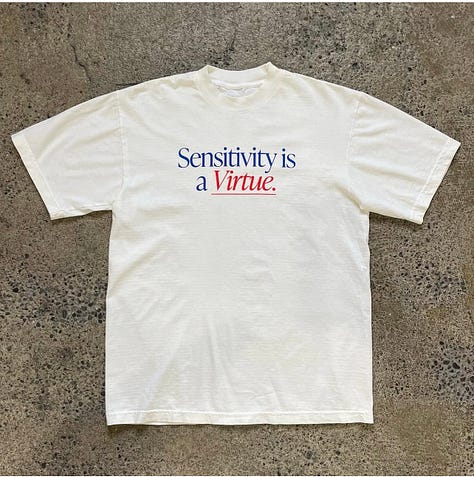
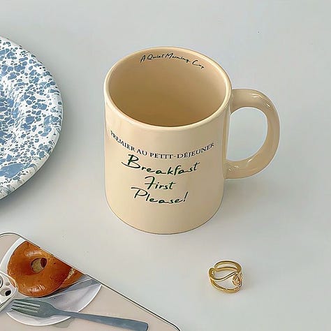
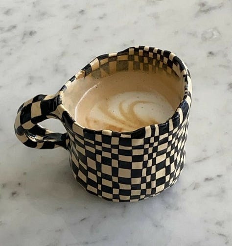
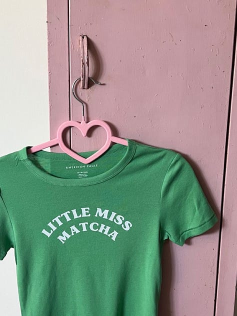
If we had merch, what would it look like?
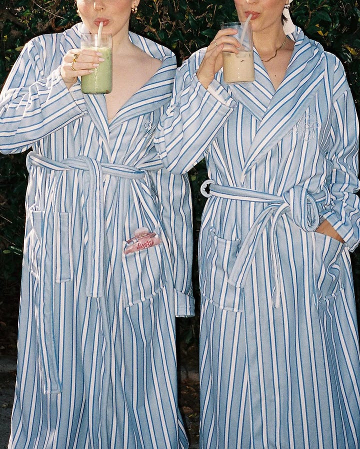
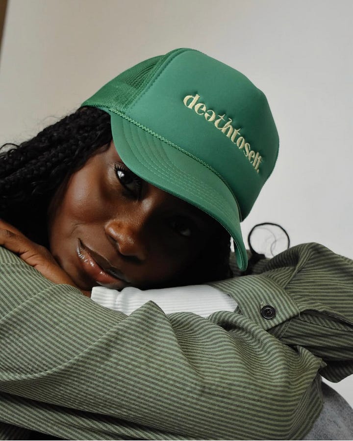
Merch for TIM should reflect its youthful, creative, and introspective vibe while still being stylish, playful, and practical. The designs would lean into aesthetics that are both minimal and thoughtful, with a bit of an edge—yet still soft enough to capture the reflective and feminine side of TIM.
Bottom line: It should be functional but very Instagrammable and Pinterest-worthy.
Merch ideas:
T-shirts, mugs, phone cases, journals, prints, caps, stickers. On my creative bucket list for this year is to print graphic T-shirts I’d love to wear inspired by TIM and also some nice mugs that embody the TIM mood (mugs because I love matcha and tea).
A few phrases I’m thinking of:
Just stamp ‘it-girl’ on my forehead
God abeg!
Surviving Lagos traffic one matcha at a time
World’s most creative (over)thinker
Sorry, I’ve been musing...


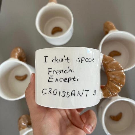
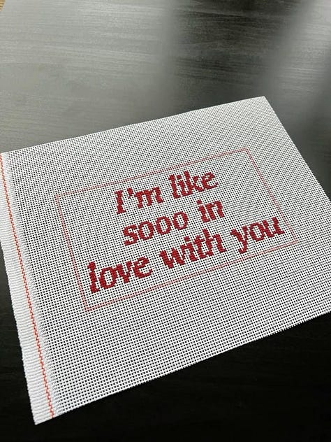
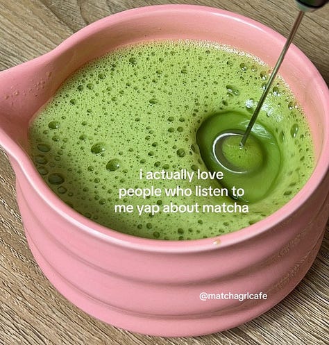


If we were a season, what would we be?
It’d be Autumn or Lagos seasons—either rainy or dry. Change, introspection, and the cozy, reflective energy that comes with it—qualities that speak to TIM’s vibe of discovery, creativity, and growth.
Lagos has its distinct seasons. As much as I love Autumn and want TIM to be aspirational, I also want it to be realistic because Lagos is home. It’s just a matter of deciding how the TIM aesthetic shows up here, but that’s not hard because I use my own Instagram as a mood board for that.
Now, who is the TIM girl?
If TIM were a person, she would be a creative, introspective individual with a keen sense of style and a knack for balancing depth with a sense of humor. Think of someone who's a mix of intellectual and artistic, with an eye for beauty and a heart for creativity and self-discovery. She’s honestly just real or at least tries her best to be.
If she were a specific person, she’d be a mix of Tracee Ellis Ross, Solange Knowles, and Zoë Kravitz.
She’s thoughtful, observant, and always paying attention—to culture, to creativity, to the quiet shifts shaping how we move through the world. She’s not just consuming; she’s reflecting, questioning, and letting what resonates sit with her.
She’s drawn to beauty, but not just in the aesthetic sense. She loves things that are well-made, well-written and well-thought-out. She collects moments, words, and ideas that stick. She reads essays, listens to long-form conversations, and saves things for later—knowing she’ll return to them when the time is right. Faith is woven into how she sees the world, not in a performative way, but as a quiet, steady presence guiding her through life. She’s navigating life with God and letting Him reveal who He is and who she is as well.
She moves through the world with intention. She doesn’t rush to have a take on everything—she prefers to sit with things and let them unfold. She values depth over noise and connection over everything. She moves through the world with curiosity, always drawn to the why behind things.
She loves a good matcha and iced tea moment and is that friend you ask to take the pictures for the group or plan an Instagram post. Thoughtful about details, she knows how to make things look and feel just right—without overthinking it.
What music would she listen to?
Gospel, Pop, Soft R&B, Oldies, Musicals (think Disney, Mamma Mia, Hamilton), Soundtracks, Jazz, Afrobeats—she doesn’t limit herself but is open to any genre and appreciates music in general, as long as it's not derogatory or profane (giving space to the Holy Spirit to convict her about her music choices too cause she tries to be intentional about what she takes in).
Deciding on the fonts:
So many things jumped out to me while scrolling through Instagram, and I made a board there to save for later.

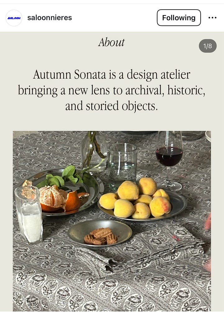

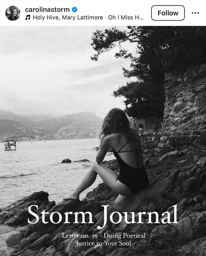
I wanted the fonts to embody that romanticized and classic feel but also still be very modern with a bit of an edge. This is what we went with:
Deciding on the colors:
So, the colors I was sure of were cherry red, butter yellow, and blue. After browsing through Pinterest, these just stood out, and I love the color combination. Now, I know it can give very primary color energy, but this is where picking the right tone comes into play. Instead of a bright, fiery red or a dull one, I’d go for a cherry red instead. Butter yellow because duh. I’m obsessed—and so are other people, too, apparently, because it made it to Pinterest’s predicted colors of the year. Blue, because something about a baby blue just makes sense to me.
Also, pink—because, at the end of the day, I’m just a girl. But I wanted the pink to have a bit of an edge to it so it differed from the classic pink. I stumbled into this cherry cola color by accident while scrolling. I came across this pic of this cup and this couch, which instantly caught my attention.

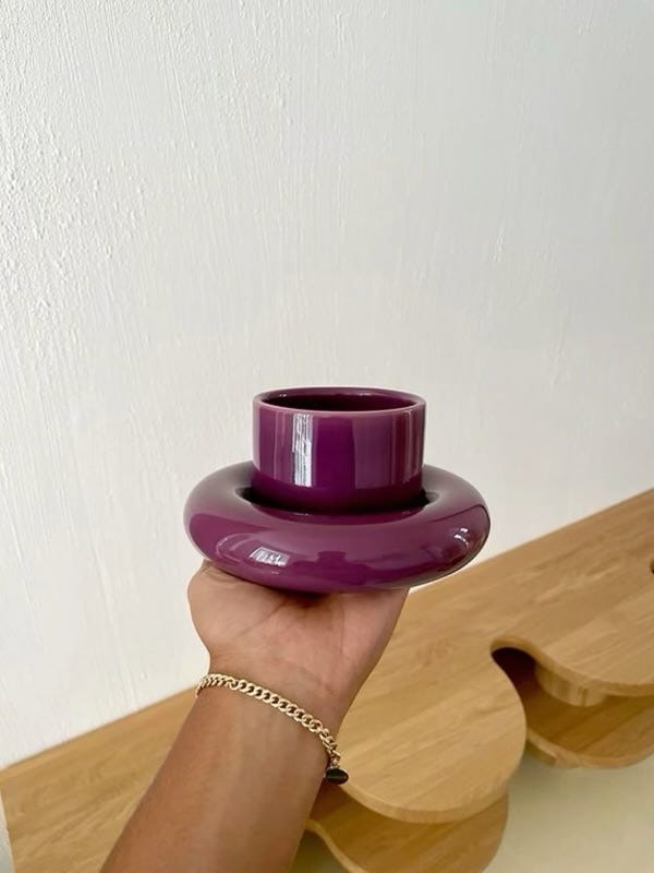
Now, for those who don’t know—I’m a purple girl for life! While the other girls were loving pink, I moved towards purple, probably to be different and rebel (she’s not like the other girlsss, but I so am lol!). I’ve always loved lilac and bright purples, but something about this deep purple spoke to me, and I’m not mad at it at all. There’s something there about evolving as a person and your tastes and preferences growing as well, but I won’t get into that.
The results:

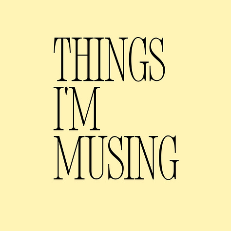
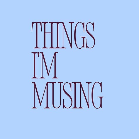


What this process taught me: making time to be creative outside of work and honestly letting go and letting God - talk about how I was lowkey stressing over doing this in the new year but felt God tell me to calm down and in the right time it’ll all come together. Have fun, and do what feels true to you. I love branding principles but I want TIM to represent myself as much as possible which means not limiting myself to color principles, font principles, etc.
Now my next activity will be learning how to use Figma so I can create my portfolio.
Let me know which colors you prefer and what you think!


Ah!!! Love this so much 🥹🤍 the creative process is everything. Love it, oh I already said that 🤭
this is perfection 🤍💐 I’ve been subscribed for a minute now and this perfectly sums up why I’ve been obsessed with your publication. I am a TIM girl to the T, thank you creating this space!!!